Visualizing Assessment
Do you ever look at something and know it doesn’t look right, but you just cannot figure out why? Perhaps more troubling than not knowing what is wrong, is not knowing how to make it right. Over the last ten years, I have poured over tons of assessment data from several different institutions and have yet to be inspired. The most recent reports I read contained an inordinate amount of information- standard deviations, n values, means and modes- a veritable testament to the art and beauty of technical writing. As an academic administrator, however, I need assessment data that proves unequivocally, that we are providing academic excellence. Sure, there was an executive summary that highlighted a handful of revelations, but I also knew that I would have to delve into the hundreds of pages of statistical analysis and data to get the whole picture. If only those compiling assessment reports could remember a picture is worth a 1,000 words…or numbers!
I concede that revolutionizing the assessment process is not nearly as provocative as being a disruptor or as rewarding as flipping your classroom, but it can be. What if we flipped the assessment process and started with the governing boards instead of starting with the students?
Currently, we start with the student and assess their level of achievement and engagement. We then ask them to assess the performance of their professor. Then, the professors are assessed by the Department Chairs, who are then evaluated by the Dean, and depending on the organizational structure of the institution, there could be a few more layers, but ultimately, this information is delivered to the President who then must present it to the Board. And the irony of it all is that the Board must then decipher large amounts of very granular data and interpret it in a way that will have very real outcomes for faculty, staff and students, and will shape the public’s perception of the institution itself.
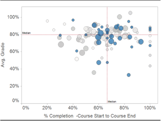
 In my experience, when institutional financial data was presented to the board, it was not volumes of budget line items, variations, and department codes. Instead, it was a set of simplified financials that included a profit and loss statement, balance sheet and statement of cash flows. Although there were massive amounts of data required to produce those few pages, we were able to give our Board a cogent analysis that enabled them to do their job. What if we gave our boards a visual representation of how well the institution is performing academically, based on assessment data the institution deemed important; with success defined as moving more classes to the upper-right-hand coordinate?
Current technology allows us to create visual representations of assessment data, in real time, not just financial data. Although having the results of a data query on student achievement as measured by professor engagement may not be on the agenda at the next Board meeting, having the ability not only to access the information but also to interpret it in a way that provides the board with an accurate measurement of the academic operations of the institution. When assessment data is presented in a way that allows meaningful comparisons, whether it is regarding financial data or student retention data, it allows the Board to truly hold administrators accountable for the assessment of the overall academic health of the institution.
 Am I saying that Boards should hold the President accountable for the academic success of the institution? ABSOLUTELY. And they already, do, in theory. But here is what I mean about flipping the model. The data is available and should be used at all levels to ensure academic excellence. A Board that can utilize assessment data quickly to identify a potential problem in one department must hold the president accountable for its solution, as visualized in chart 1. The President should then hold the Academic Vice President and department chair accountable for investigating and resolving the issue. That might be a comparison of departments based on more granular data, say by department or division as shown in this chart. It is at this level that the value of the assessment data increases as it becomes more granular.
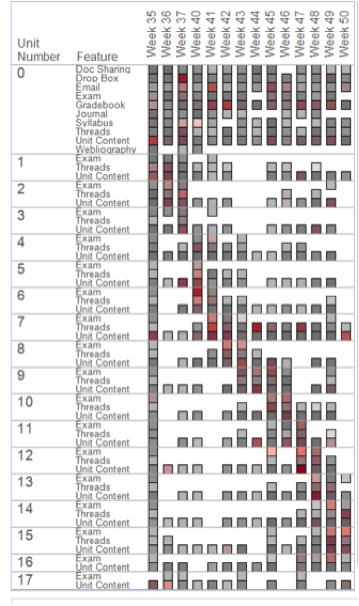
 Once we have identified the courses or courses, technology allows us to look at student performance in individual courses, individual learning assets, and student engagement with each other, the professors and the content also provides a sophisticated picture of the localized problem and commands accountability at all levels. This is where flipping the model becomes very exciting. The chart to the right shows how students are engaging with the content of a particular course. We can use this information to know which content items the students are actually using to acquire knowledge and the frequency in which they were used. A professor can now visually identify the areas of his or her course that are not as successful at conveying the desired knowledge to students and replace that learning asset with an asset they believe will better empower the transfer of knowledge.
Just as I assert that Boards should hold the President accountable for the overall academic success, the President should hold his faculty accountable for student success. This is the apex of academic freedom. The professor, as the subject matter expert, is responsible for the successful transfer of knowledge to the student, and through assessment data, can see what teaching asset, technique or engagement styles is the most effective at transferring this knowledge. With freedom, however, comes accountability and professors must be willing to change the way they teach based on assessments, change the learning assets of a course and must utilize the available technology. Department chairs must be willing to hold professors accountable for student success. Presidents must be willing to hold academic administrators accountable and boards must, therefore, hold presidents accountable for overall institutional academic performance. This will require a bold new level of accountability that can be easily achieved once we flip the way we currently view and use assessment data. Picture that.

